This week will continue with the Platinum Grimlock in Robot mode.
Robot mode:
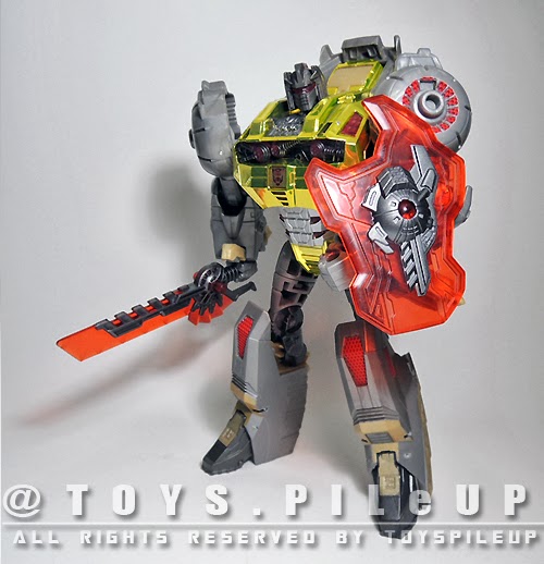
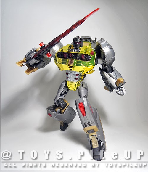
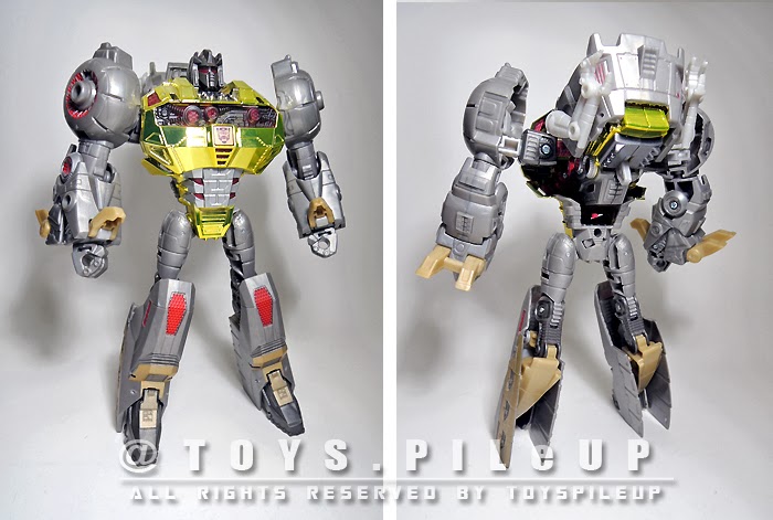 Considering the recent downsize in almost all the WFC/FOC figures, I am glad that Hasbro still remember making Grimlock huge and bulky.
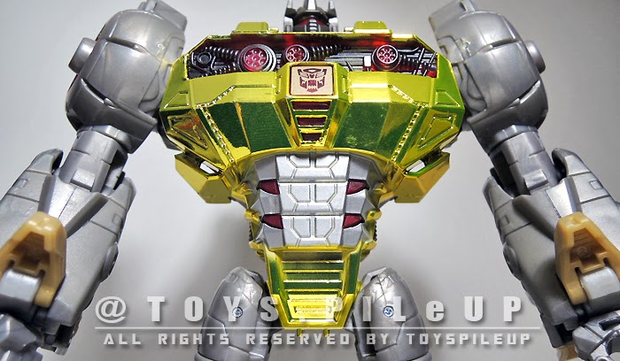
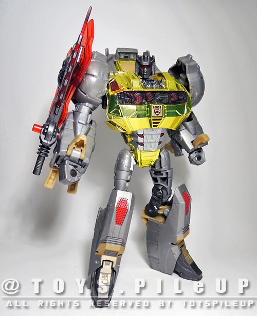
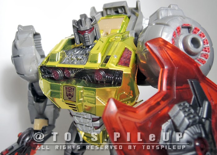
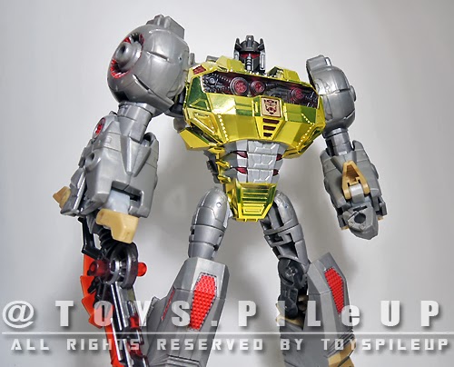
The repainted Grimlock immediately standout among the rest in robot mode. This is due to the eye blinding 'shiny' gold chrome on his chest plus the generous details that Hasbro has added throughout the figure. The mixture of Clear red and Gold chrome is indeed an excellent choice.
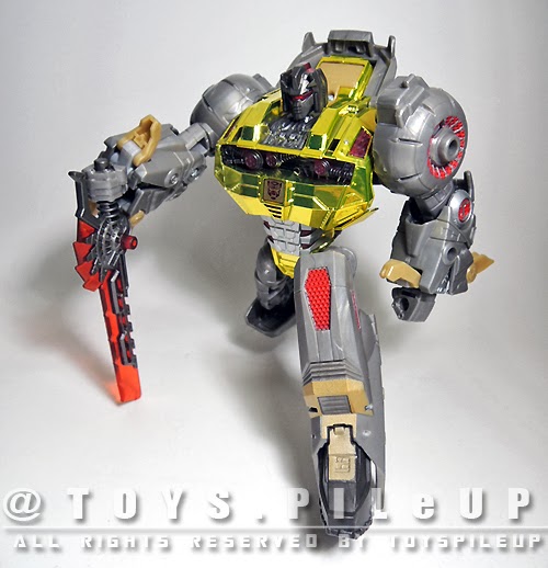
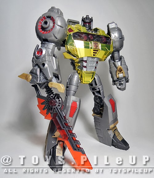
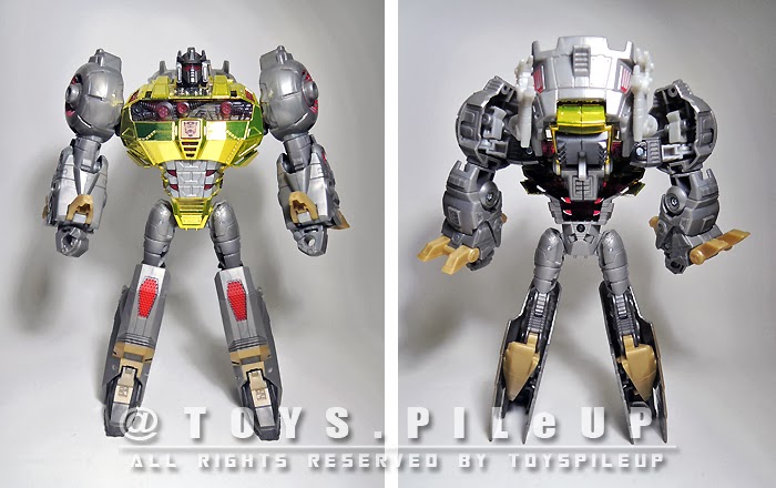 The proportions looks good even though Grimlock looks a little like some bodybuilder who puts too much effort on his upper limbs and little time on his lower limbs. The upper limbs looks exaggeratedly beefy but the lower limbs look too skinny especially the thigh area.
Lets take a closer look at the details.
Details:
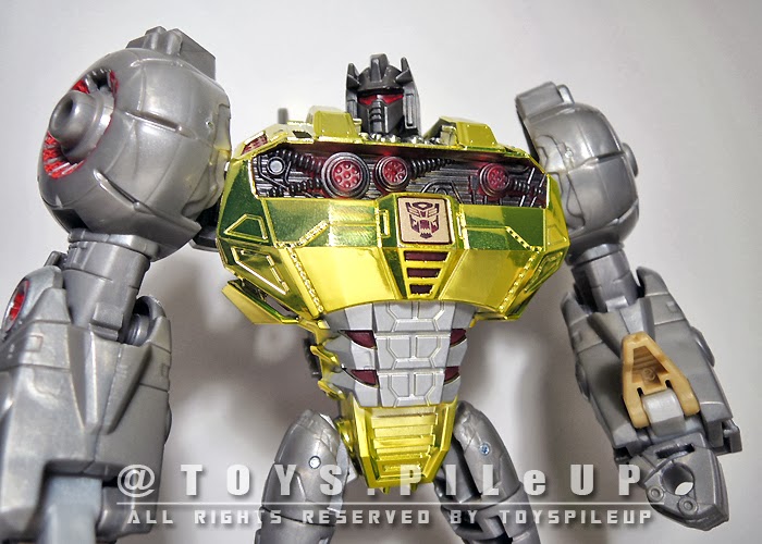
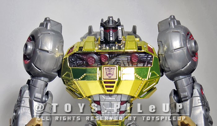
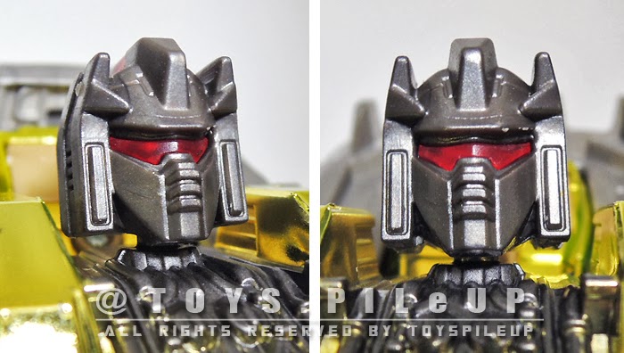
I am glad that Hasbro decide to stick with the G1 head design that comes with the mouthpiece rather than the oversize pointy jaw seen in animated series. The red transparent visors like all other figures lights up when there is a light source placed at the back of his head.
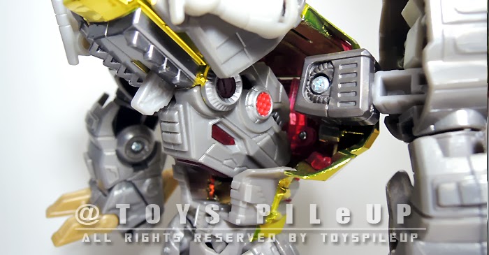
There are some fine details and paint apps from the chest to the torso area. I thought if the dino crawls are having the same metallic grey paint as the torso, it will look great.
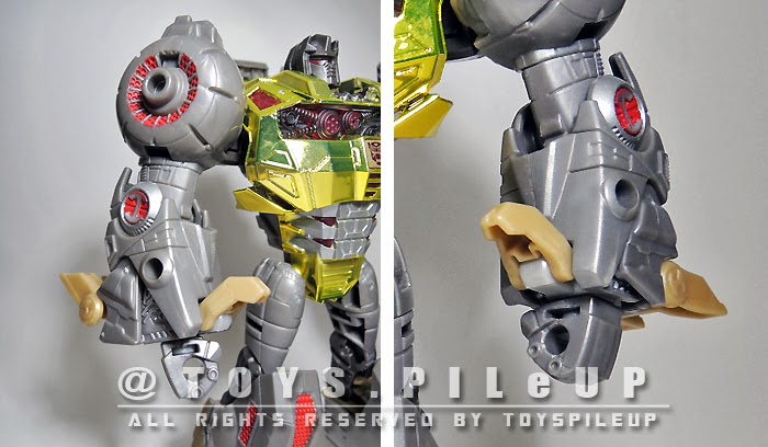
The upper limbs had some fine details as well enhanced by the red paint apps. There are also some open pegs holes to mount his accessories. Somehow, Hasbro should think of a way to hid the dino crawls as they look out of the way.
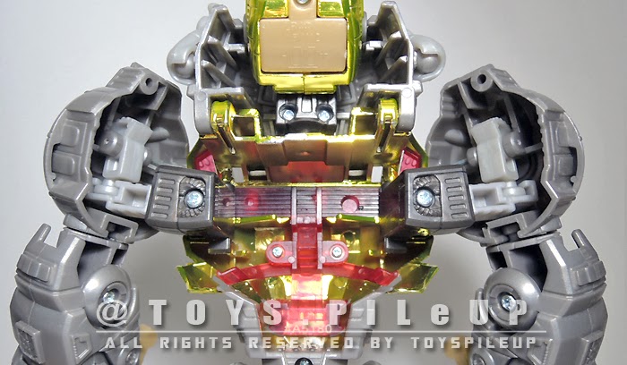
From the back, you can truly see how hollow the entire figure is from the neck area all the way down to the torso. They are all hollow plastics. Even the upper arms are hollow exposing all the ratchet joints.
You would have guess that getting the body hollow like a nut shell is some cost reduction measures but if you look further, the dino head can be rotated all the way into the hollow section. In fact, the mouth sits nicely facing the front of the body. I bet you should know by now why the body is design this way.
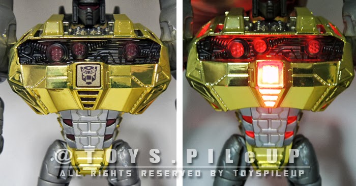
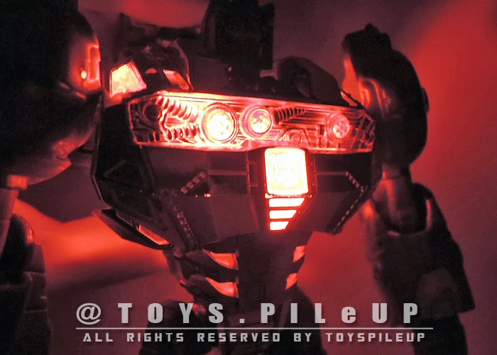
Yes. You are right. The dino head sits inside the back of the body to add as a light source from behind. When activated, the light shines directly at the chest area resulting in a lighted up chest as well as the Autobot logo. Pretty cool i would say for Hasbro to come up with this 2 in 1 gimmick.
The effect looks better under dim lightings.
Articulation and Posing:
 Grimlock has a fair amount of articulation throughout in Robot mode unlike his dino mode. Playability in this mode is much better than the alternate dino mode.
The weapons can be attached to the pegs on his arms.
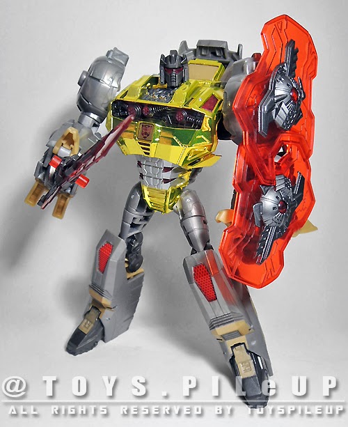
The weapons are very game accurate but I personally find the shield too small for his huge body.
If you have 2 sets, you can mount 2 shields to make it look bigger.
Overall:
This FOC Grimlock's overall transformation sequence and outlook is by far the closest to the G1 version. Articulation is an area that needs improvement especially in Dino mode. Joints are far too tight even to the point of breakage. Good for display but not for playing. The light up gimmicks is a plus point, reminding me of his fearsome flame throwing seen in the game.
If you have to choose
between the Hasbro, Takara and this Platinum version, I would highly
recommend this chrome version. The Chrome finish and better paint apps
make it stand out amount the 3.
Outlook: 8/10
Articulation: 5/10
Playability: 7/10


 The proportions looks good even though Grimlock looks a little like some bodybuilder who puts too much effort on his upper limbs and little time on his lower limbs. The upper limbs looks exaggeratedly beefy but the lower limbs look too skinny especially the thigh area.
 Grimlock has a fair amount of articulation throughout in Robot mode unlike his dino mode. Playability in this mode is much better than the alternate dino mode.


No comments:
Post a Comment